Impression of a website that changes with smartphone compatibility|Points to review for UI/UX improvement

Problems with the website that are not in line with the smartphone era
Today, many users browse websites from their smartphones.
Among them,
Small letters
Buttons are difficult to press.
Difficult to find information
The site is in the state of,
It is not uncommon for them to leave the program in the middle.
Even though it looks fine on the computer,
In many cases, it is difficult to use a smartphone.
What is UI/UX (simply)
The terms UI and UX seem a bit difficult,
Simply put,
UI: appearance and ease of operation
UX: Overall experience when using the product
refers to.
In other words,
👉"Whether it can be used without hesitation and without stress"
is important.
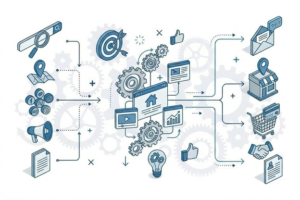
Common Improvement Points
The points that are often reviewed for smartphone compatibility are,
Actually, it is simple.
Small letters / Narrow line spacing
If it is difficult to read, that alone will lead to disengagement.
Buttons are confusing.
The state of being lost as to where to press can be a major opportunity loss.
Too much information is crammed in.
Organizing information is especially important on a smartphone.
Slow display speed
Slow loading alone increases the likelihood of disengagement.
Lead design that leads to inquiries
In viewing on a mobile phone,
Can you act immediately?
Or you can move on without hesitation.
is important.
For example,
Place the button in the appropriate position.
Be aware of the scrolling flow
Show the necessary information in order.
and by design,
User movement will change dramatically.
Not only in appearance,
👉It is important to design based on "how to act".
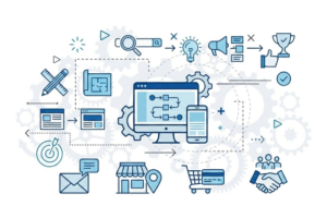
Example of improvement (example of a concept)
For example,
Fewer inquiries
You're leaving in the middle of a project.
In cases such as,
Review the order of information
Adjust button placement
Optimize the way it looks on a smartphone.
and other improvements,
The usability of the site will vary greatly.
Results,
The user is more likely to proceed to the next action.
Summary] Ease of use changes the impression of a website.
The website is,
Not just "look."
It's all about "how it's used."
Especially on smartphones,
. easy to understand
I'm not lost.
I'm ready to move.
The design must be such that
Even a little review,
User impressions and behavior will vary greatly.
About Consultation
How the current website looks on a smartphone,
It can be organized based on how it is actually used.
I don't know if smartphone support is appropriate.
I feel it is difficult to connect to inquiries.
I want to know where to improve.
Even in the case of,
We will make suggestions based on priorities according to the situation.
Contact us for consultation on website creation and improvement
- What is SEO-friendly website design? Key Points for Designing a Search-Resistant Website
- 10 checklists to avoid mistakes in website creation|Points to check before commissioning
Related Articles
-
 What Is a Web Branding Strategy? A Framework for Creating a Corporate Website That Stands Out
 -
 What Is Website Navigation Design? How to Create a Website That Generates Inquiries
 -
 How to develop a Web marketing strategy|What is the design that connects SEO, SNS, and advertising?
 -
 What is Web Strategy? Design concepts to review when creating a website.
 -
 Points to review when creating a website for a small or medium-sized company|Web strategy to be pursued with a limited budget
 -
 Website Creation for BtoB Companies|Points for Designing Websites that Easily Lead to Inquiries
 -
 Relationship between Website Creation and Attracting Customers|Design that Links SEO, SNS, Advertising, and MEO
 -
 Points to Review in Website Renewal|Improvement Approach without Failure